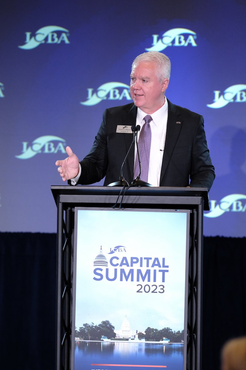
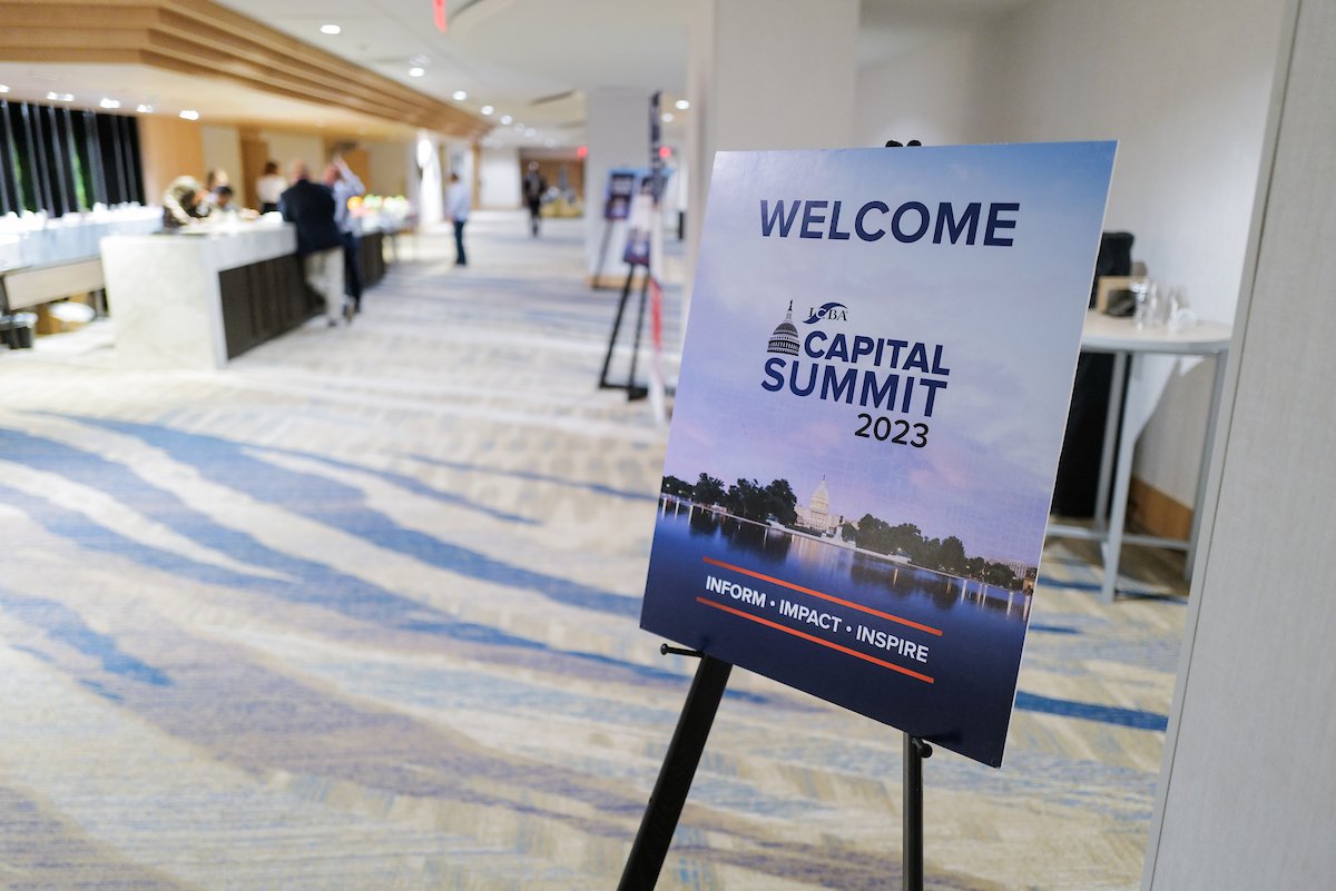
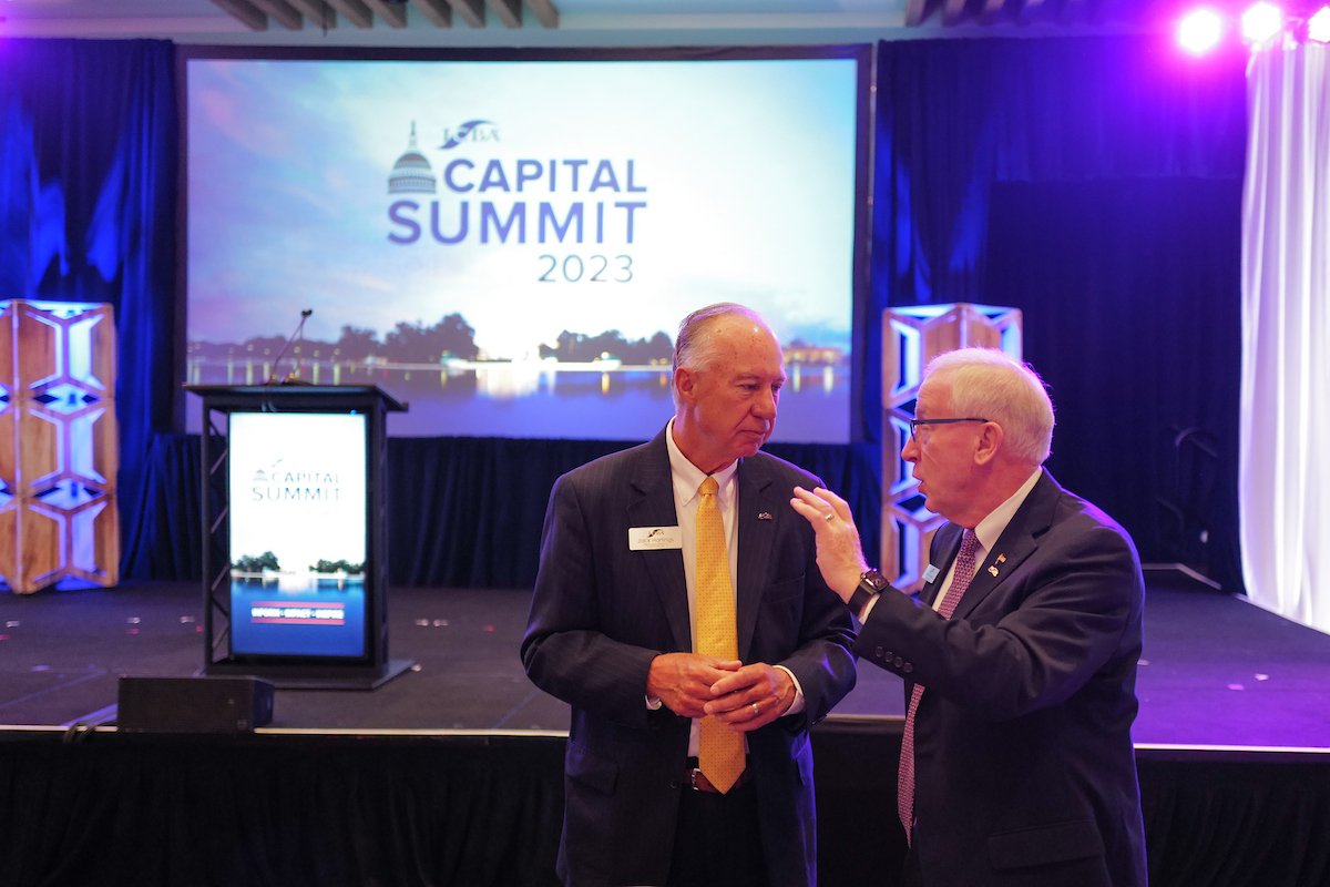
Capital Summit
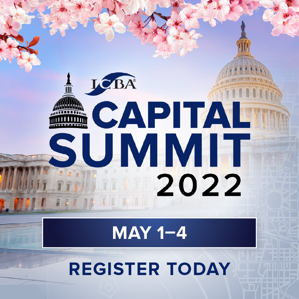
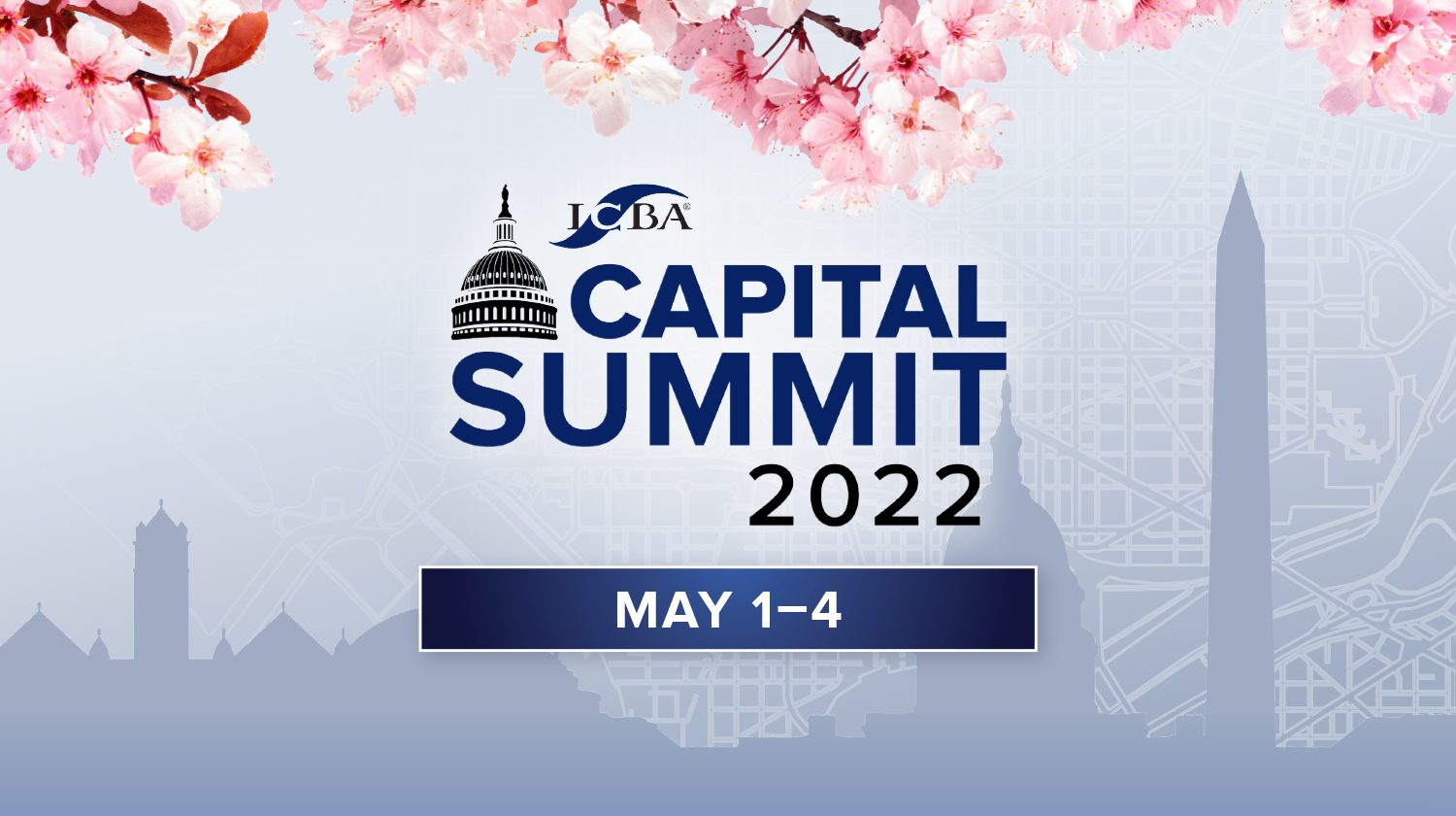
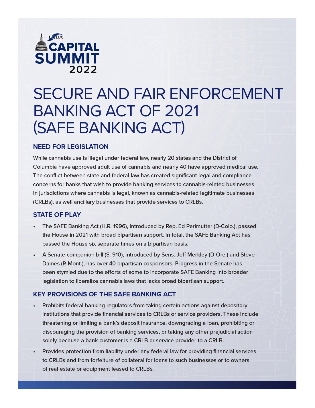
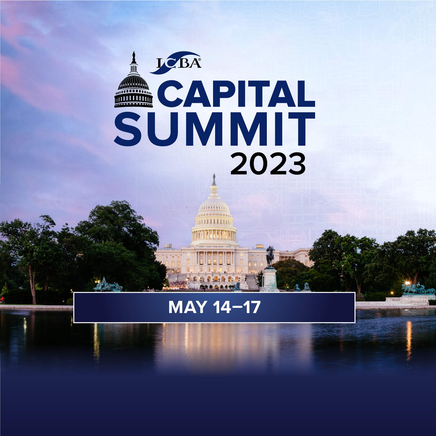
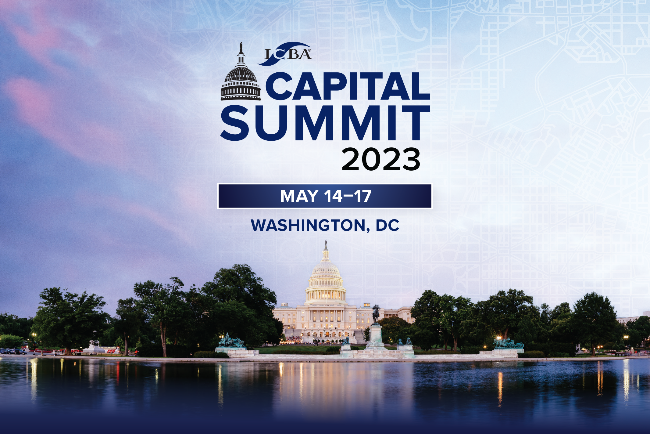
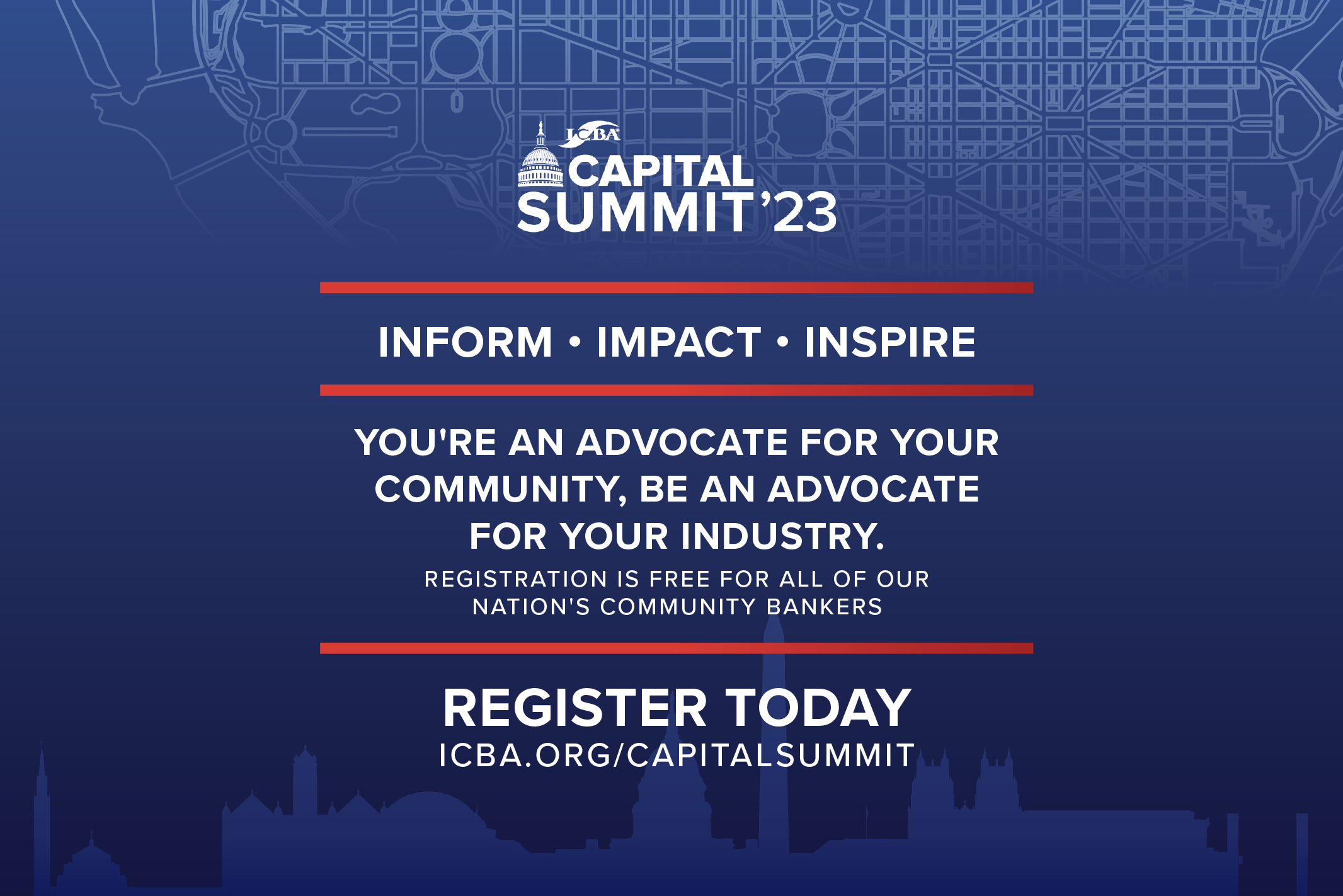
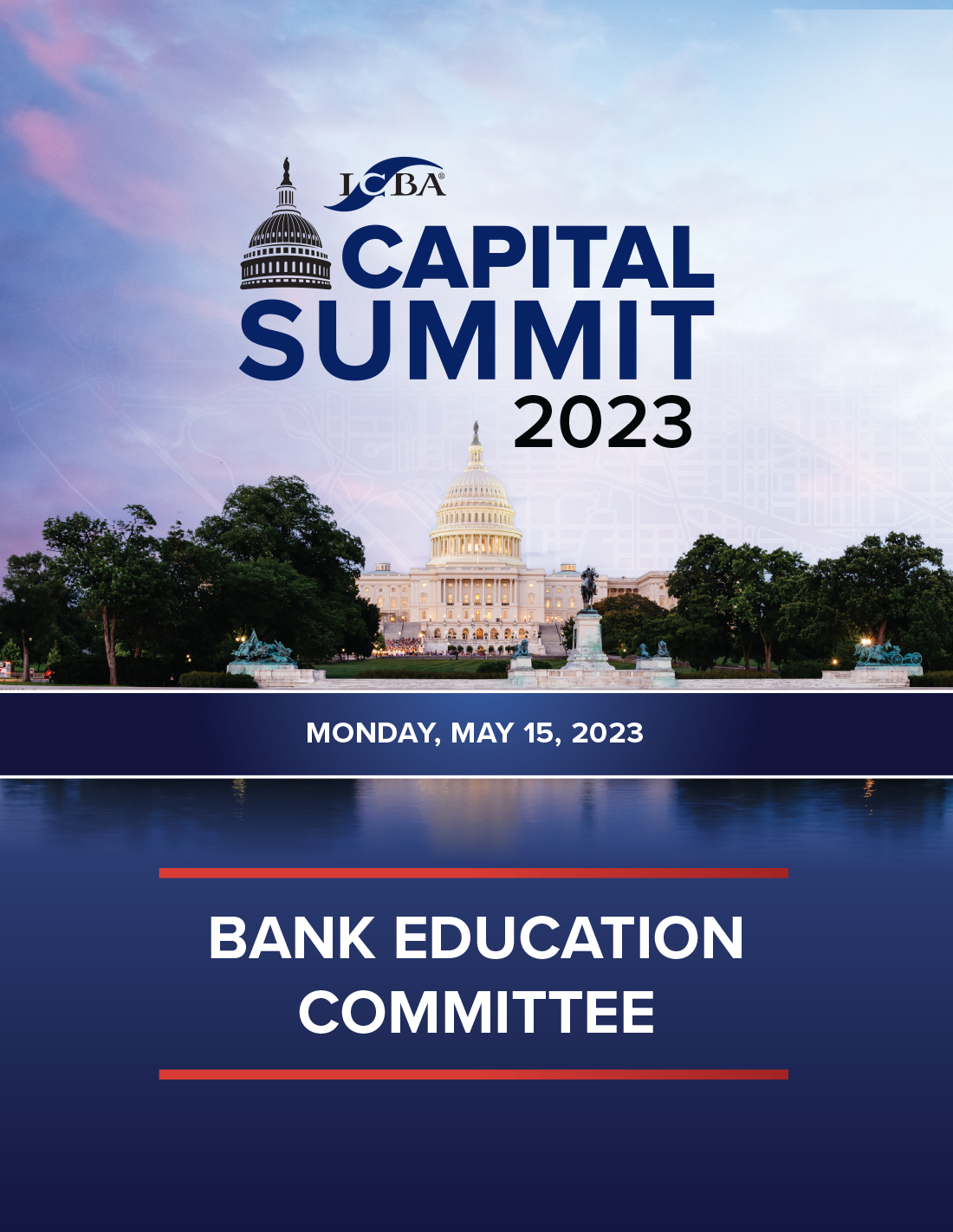
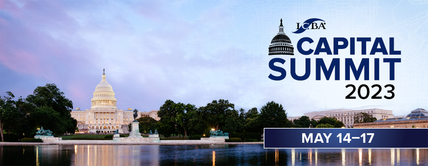
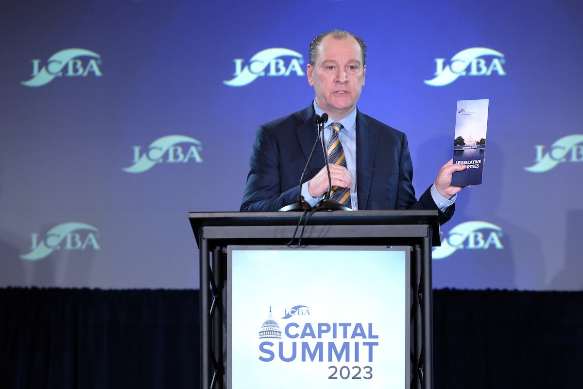
What started out as a simple logo request turned into a full campaign redesign after asking the right questions. What was formally very straightforward (stark white, classic ribbons of red and blue paired with stars), now comes alive with color gradients, overlaying maps, and feature the experience of being in DC with beautiful cherry blossoms.
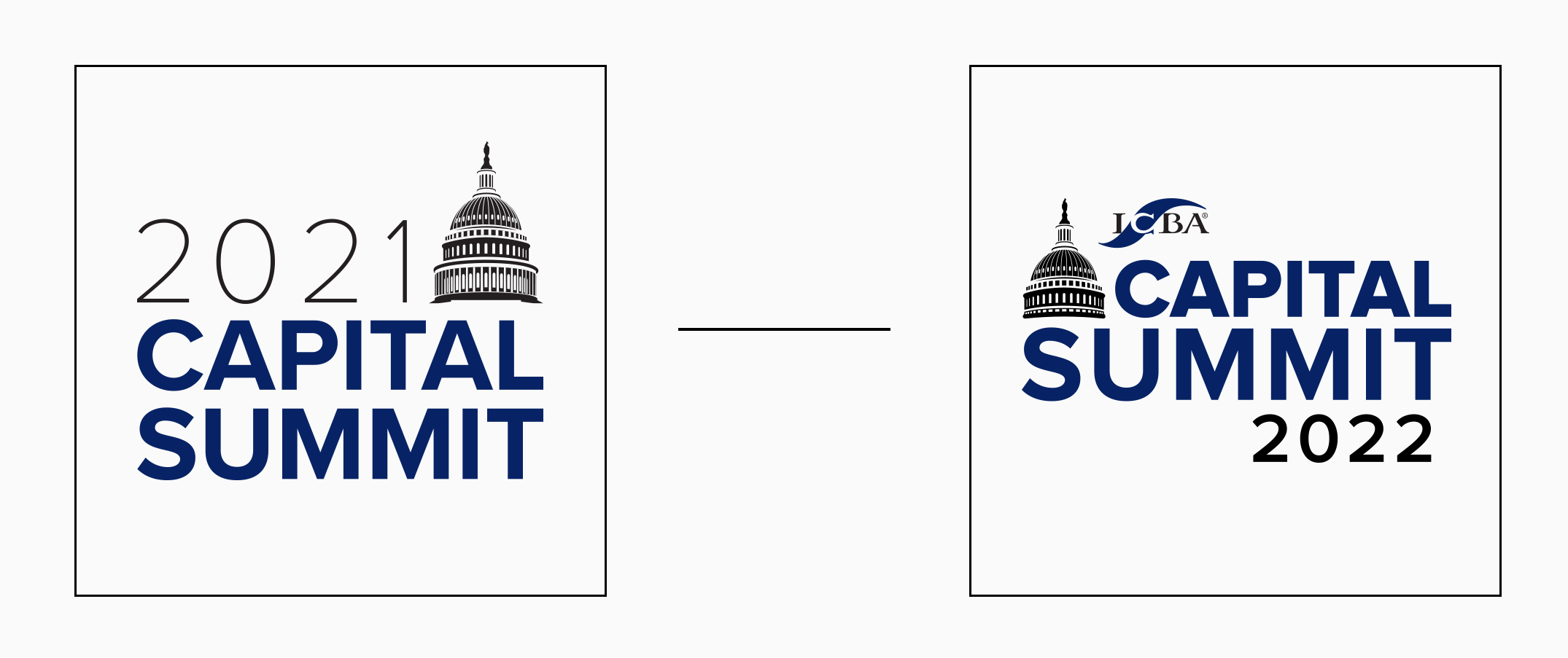
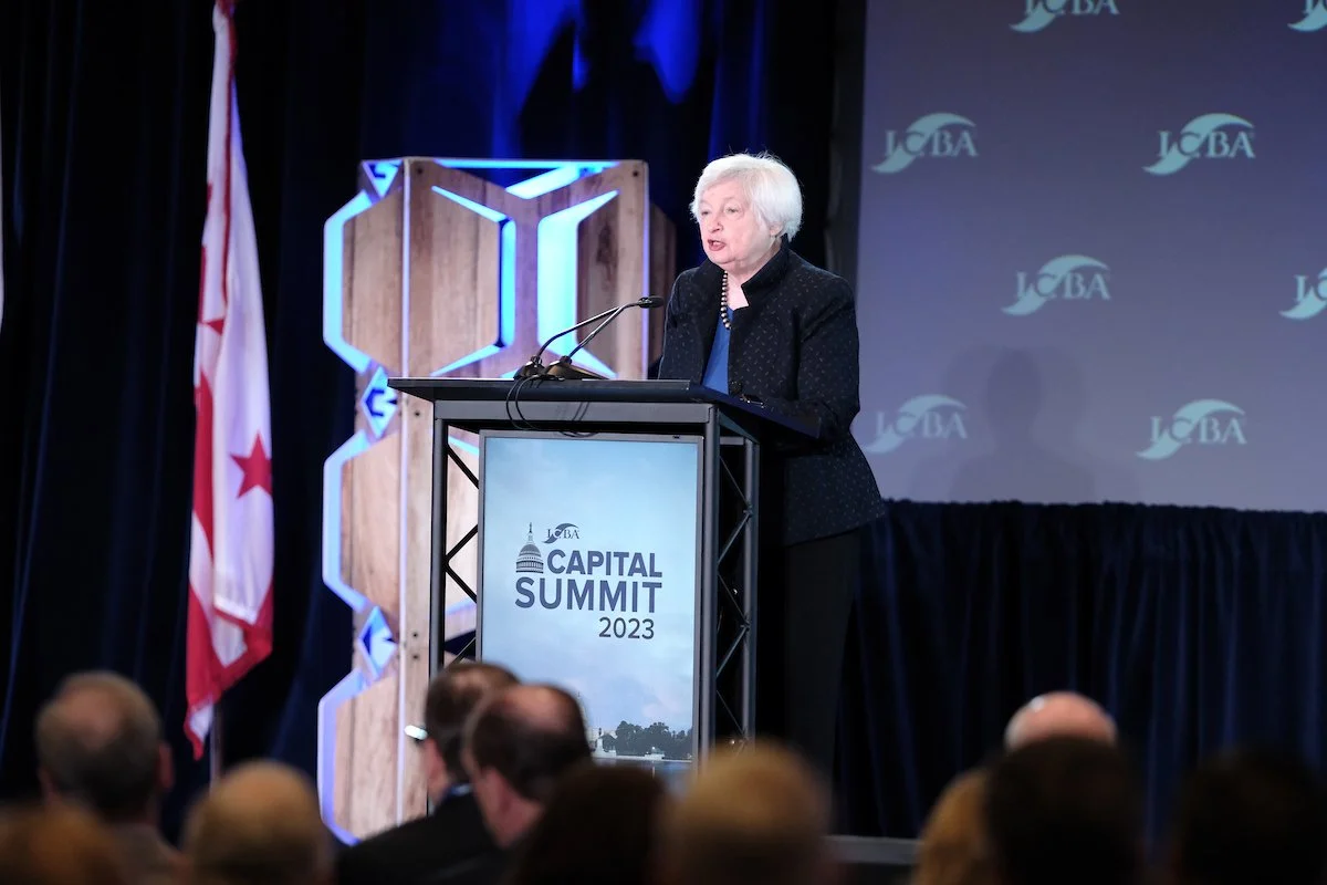
How do you bring personality into something rooted so heavy in sterile government buildings? We explored the reasons that bankers actually made the journey and came into a space of showcasing what they see in DC beyond the capital building. I added pushed assets forward with a softness in gradients, pinks and purples from the cherry blossoms and moody skies. The end result you see below is a combination of assets from 2022 and how we evolved it in 2023.
