


A MERO MERO PROJECT
Ron Leffler Real Estate:
Strategic Brand Revitalization
CLIENT
Ron Leffler Real Estate
SERVICES
Brand, Print, Toolkit
In the intensely competitive DC metro real estate market, nationally recognized agent Ron Leffler needed to differentiate his brand. He sought a partner to refresh his materials and strategy, aiming to build stronger connections with new clients amidst a sea of indistinguishable real estate marketing. I took on the challenge of crafting a brand refresh that would resonate deeply with his target audience.


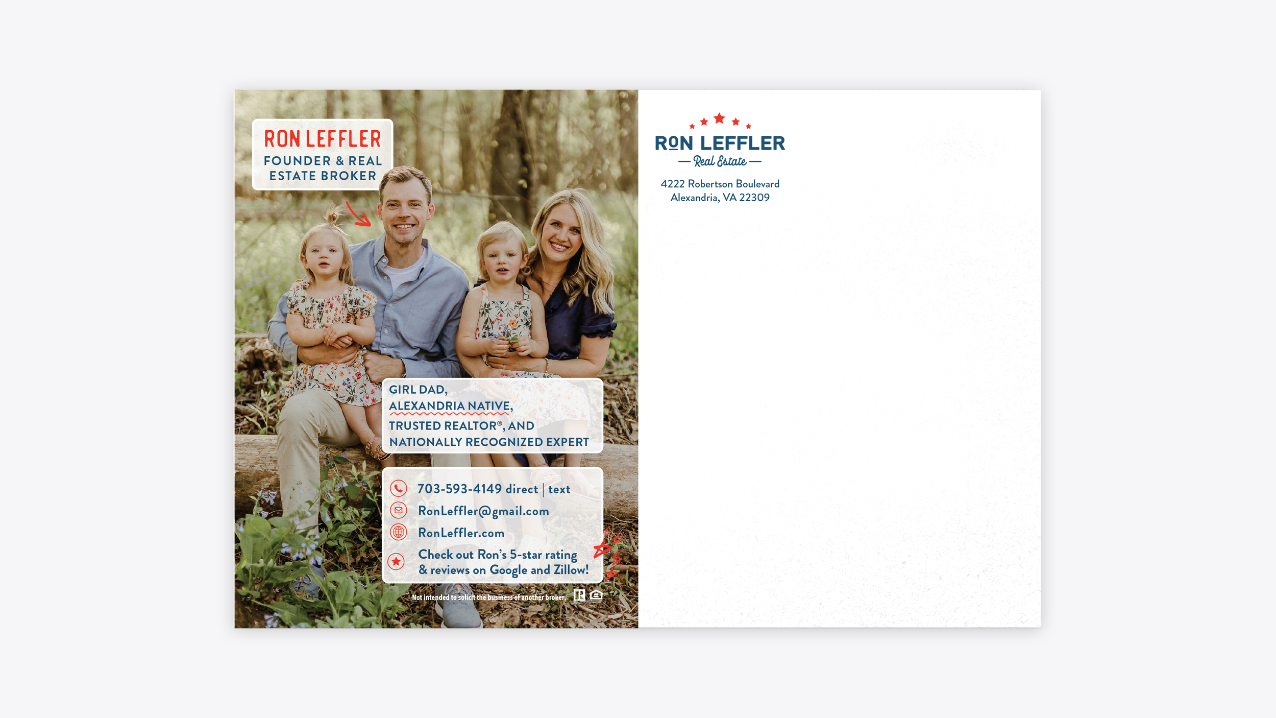

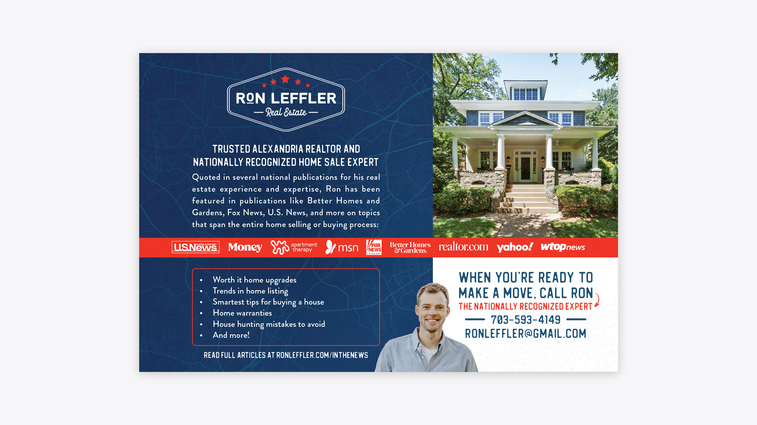

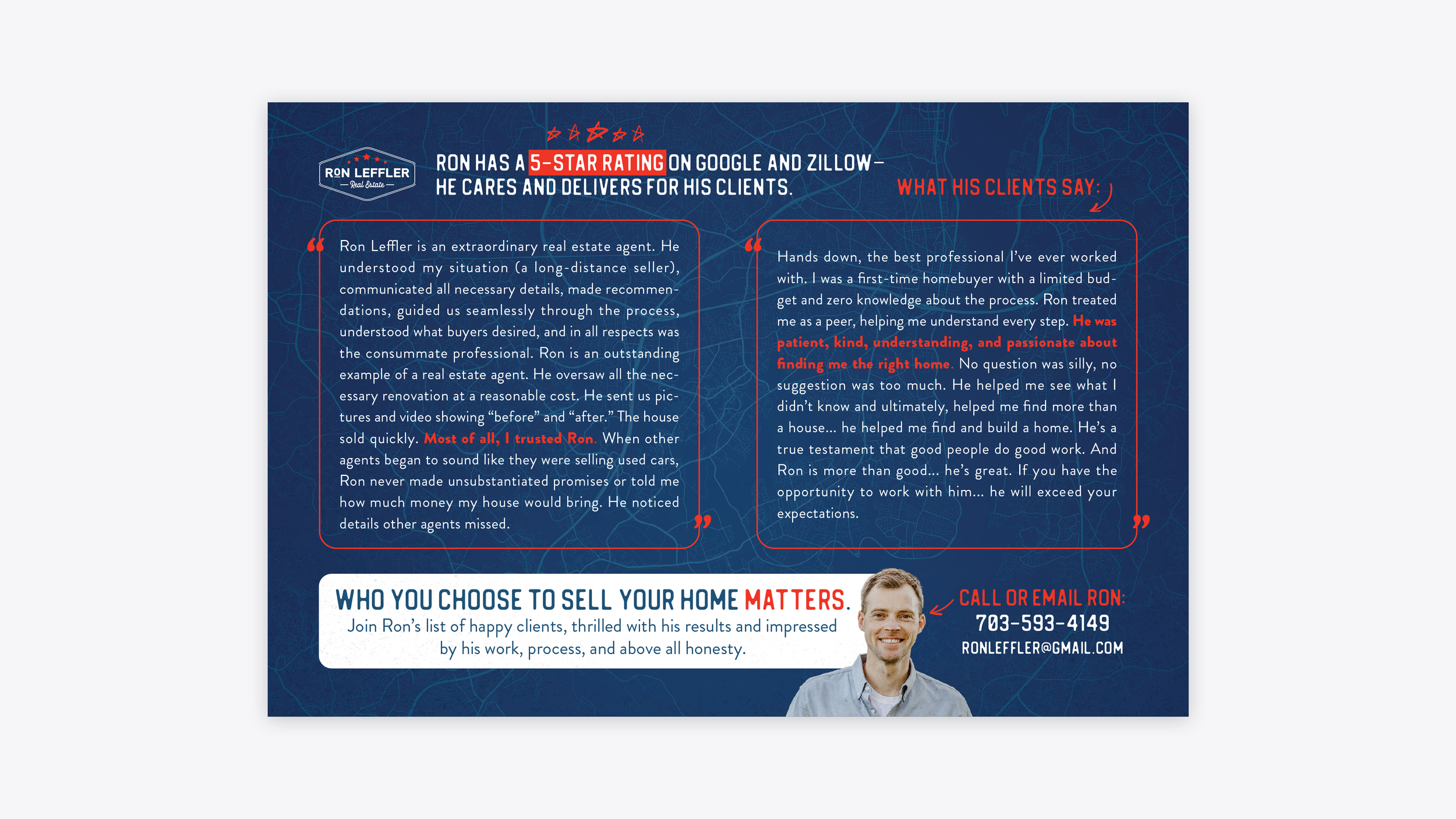

I developed a revitalized brand identity that empowered Ron Leffler to stand out in the saturated DC market. This design featured a sleek, approachable blue, integrated with a DC metro overlay and vibrant red accents, to highlight key benefits and personality. The direct mail campaign, which prominently featured client testimonials, demonstrated the effectiveness of this strategic approach. My vision extended beyond the immediate deliverables, outlining a plan to translate this impactful design into a cohesive digital presence through a website and motion graphics, ensuring the brand's continued growth and relevance.


This project highlights my dedication to meticulous craft and strategic brand development. By creating a refined brand identity and a cohesive suite of marketing materials, I equipped Ron Leffler with the tools to elevate his market presence and forge meaningful connections with his clients. This project stands as a testament to my ability to deliver creative solutions that drive tangible results in competitive markets.
